Of all the visual elements at their disposal, graphic designers, I’ve been told, more than meet their match when it comes to the ampersand, that thousand-year-old sign for “and.” A prominent part of a headline or a company name, the “&” not only sticks out and commands attention, challenging graphic designers to make the most of its line, it also serves as a bridge between two or more components.
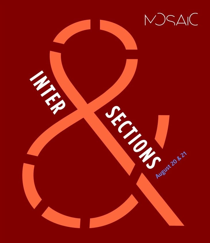
The use of the ampersand as a cultural practice is equally challenging. What does it mean to think of the “&” as a programming opportunity, a way to engage and expand one’s frame of reference, an expression of good will?
For the outgoing cohort of students in GW’s Program in Experiential Education and Jewish Cultural Arts who were responsible for designing a whirlwind orientation, known as Mosaic, for the incoming cohort, translating the ampersand into action was key.
Making connections between the students and the city; between the students and the organizations at which their fieldwork placements would take place; between the students and Jewish history; between one group of students and another defined the enterprise, from start to finish.
Though Mother Nature wasn’t entirely cooperative, raining -- quite literally -- on our parade, here’s hoping that both those who are new to GW and those who are taking their leave of it are now bound together by the “&” that lies at the heart of the Program in Experiential Education & Jewish Cultural Arts.